Our first day went pretty smooth. With our little
barcode scanners we just buzzed along through ten room
changes. I have to say, a lot of work went into this.
And I don’t just mean the 4As. I mean, Singapore
really did a lot of work this year.
Some of Singapore’s proven winners are here. There is
a lot of new material too. Work entered under craft
for illustration was at an all time high. And for some
reason, we didn’t see a lot of ambient work this year.
However the poster category was up in full force. Will
get a breakdown later and post a little pie chart so
you guys can strategize for next year.
There were some things I learned as well. If you have
a CD with a Quicktime attached to your outdoor,
ambient or poster entry, I think it is best to attach
it to the front. Not the back. This is for obvious
reasons. (So we don’t forget it!) Judges can’t turn
the boards over anyway, so if you tape stuff to the
back, it usually gets forgotten. I caught a few of
them early in the day, but was worried I might have
missed something.
And for the integrated categories where you make DVDs,
don’t make the menu page too slick. There are times we
thought the menu page was the entry! With music and
changing visuals, it’s hard to tell. Keep it Simple is
the way to go I’d say.
Also, if you enter something in the small space
category you should enter it actual size! My own
agency entered the CCA poster (which also ran in the
1/16th space in IS Magazine) full size!!! Which I feel
missed the point entirely.
There are some agencies that like to enter the GIANT
ads, but I don’t know if that’s always the best
format. Sure, some get the impact, but others just
kind of grow out of their press category and become a
poster. If it was art directed as an A3 I personally
feel it shouldn’t be displayed much bigger. The A3
layouts with copy just seemed more precious somehow.
I always liked Neil French’s rule for table presence.
With the big white borders to frame the ad just
nicely. It always looks great on the table. It’s
bloody expensive, but I still think it gives the piece
an edge when it's on the table.
For actual printed posters however, cropping it to the
bleed just looks right somehow.
What was also missing is ads with copy! The foreign
judges quickly noted that most of our ads used visual
ideas and jokes. A condition that isn’t unique to
Singapore. But alas, there are copy ads. Just less
copy than we've seen in the past.
Overall, the day went so smooth. It’s hard to tell
what is in or out at this stage. With the bar code
scanners, we just heard little beeps. Less in the
beginning part of the day, and more after lunch.
The system worked just fine so far. But this is the
easy bit. It’s just in or out. I instructed the jury
to just decide if he was worthy or not. If something
was on the line, just vote it in. We can chuck it out
later. Just wanted a good field to choose from.
But the real test will be the medal rounds. That’s
when we have an open discussion about each piece.
Judges will then judge the piece on their score sheets
with a little zap from their scanners.
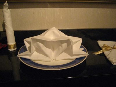
We rapped up the night with a welcome dinner for the
judges. I heard this was the first year we officially
had a welcome dinner for all the judges, CAP committee
and 4As organizers. I thought it was a great way to
start off the week.
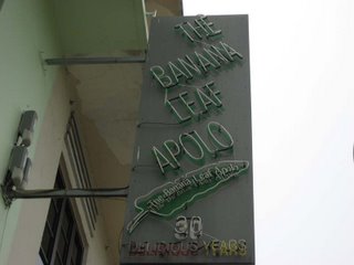
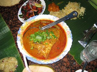
Will go to Banana Leaf tomorrow for a little fish head
curry. Nothing like a giant fish head floating in
curry to freak the foreign judges.


